


Mic.com navigation was ineffective for users. New users who landed on Mic.com were not able to rapidly understand Mic’s Unique Value Proposition, and existing users found it difficult to find content relevant to them.
In order to find the solution that was right for both the user and the company, I began a research initiative that felt a lot like crowd-sourcing. The concepts that eventually came out of the project seamlessly fell into place through gaining a thorough understanding of Mic users, both internal and external to the company.
With users clicking on the burger menu less than 1% of the time, it was clear that a traditional burger was not effective. In order to discover why, I ran first-impression user tests via usertesting.com.
The navigation was non-traditional for a publishing site of Mic’s size, and divided verticals into “channels”. Users found channels difficult to understand, especially when they came to the site unfamiliar with the Mic brand. The above quote came from a study run via Usertesting.com, and is a case in point of the jarring effect the menu had.
After running an initial study on usertesting.com, I wanted to know more about who exactly our users were. Both externally, and internally within the company. Crowd-sourcing, commence.
In rethinking the navigation of Mic’s website, I felt it was important not to alienate regular readers. To get a better understanding of who our regular readers were, I created a survey that was sent to every Mic email subscriber.
The survey was used to recruit users for phone conversations as well as gather a more high-level overview of who they were.
What we found was that our users are highly educated, and more of them fell more broadly on the political spectrum than we expected as a left-leaning website (full results not publicly available).
After the survey was conducted, 10 survey respondents were recruited to have phone interviews. Each interviewee was asked a wide range of questions about what matters to them, how they consume news, and when and why they read the newsletters and websites that they do.
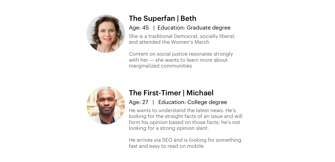
Interviews were synthesized into user personas, which were tools for educating the entire company on exactly who are users were, and how to design and write for them.
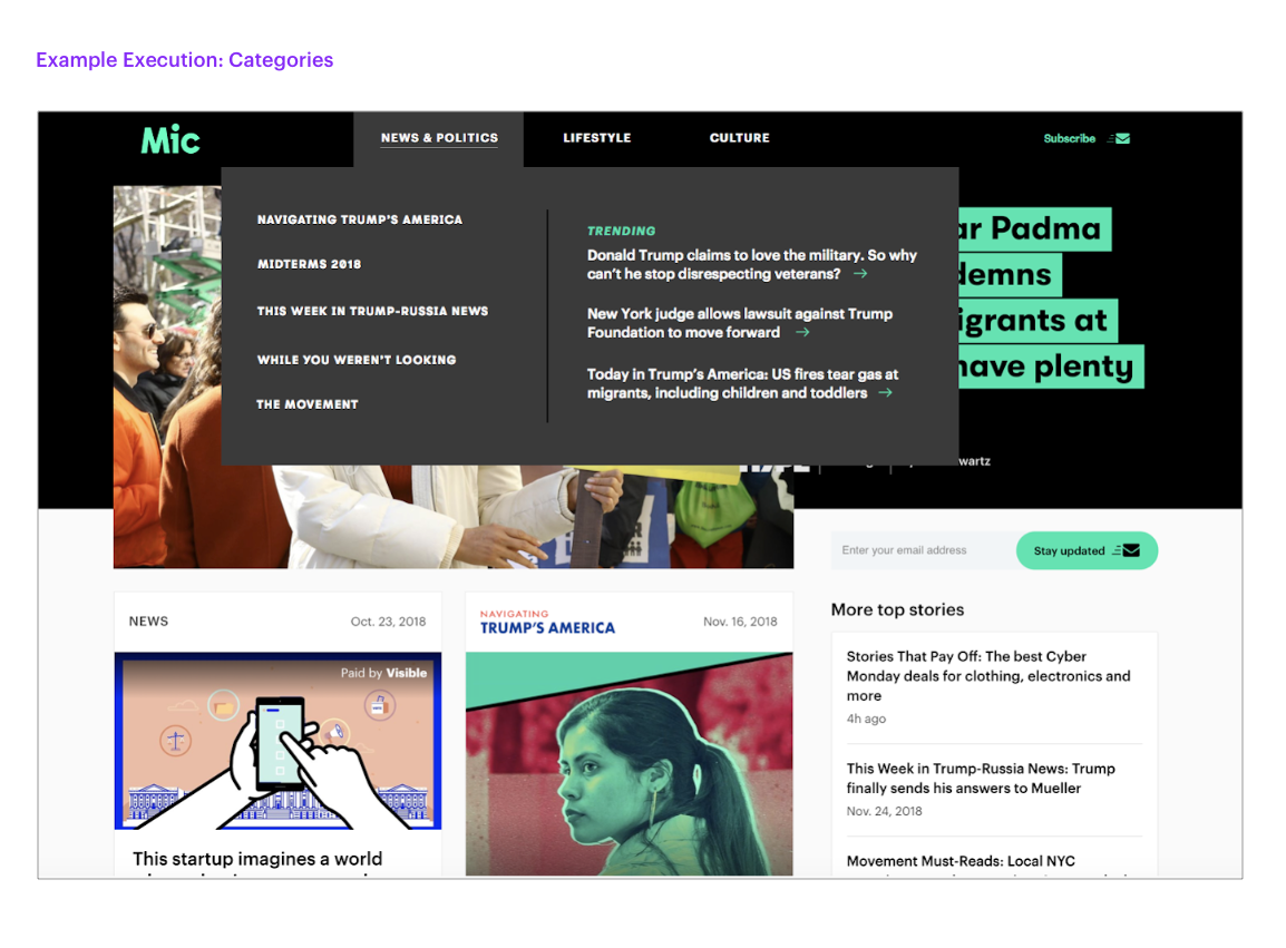
Card sorting is a great way to have structured, qualitative conversations that result in measurable data. The results made it clear that some areas of Mic’s content were easier to categorize than others. This made the team feel confident in the forthcoming decision to do away with Channels.
At this point in the process, it’s wireframe time!
Final concepts are found below.